
Deciphering Handwriting II: Renaissance to Enlightenment
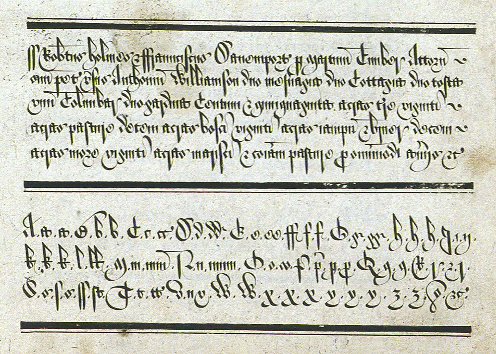
At the very beginning of the Renaissance, Italian writers developed humanist minuscule, which was less cramped and ornate than blackletter scripts. While the style is called minuscule, it does include capital letters, too. The cultural movement behind this script looked to the past and took inspiration from uncial scripts, calling the script litterae antiquae for “ancient letters” and reacted in opposition to the “modern” blackletter – another name for this style is “whiteletter”! Humanist minuscule script influenced Modernist and roman scripts in the twentieth century.

Humanist minuscule in a marriage agreement from ca. 1488. Courtesy of Wikimedia Commons.
Also in this period, a Florentine scholar named Niccolò de' Niccoli developed a slanted writing style called italic; conceptually, we still use this today when we change our font to italic in a word processing document. He found humanist letters too laborious to write, and italic reflected a desire for faster writing with fewer strokes per character and joined letters. Now we use the italic mode of text for titles, foreign words, or emphasis, practices which evolved over the next two centuries.
Up to this point I have only been discussing handwriting styles, but Venetian printer Aldus Manutius developed the italic type in 1500, basing it on the calligraphic style. Another Italian type designer, Ludovico Vicentino degli Arrighi, developed an italic type design several decades later. You can page through one of the books which he typeset, Trissino: La Poetica, at the Letterform Archive.
Writing quickly was important for clerks and workers in the growing government and business bureaucracies of early modern Europe. Two different hands emerged in this period with similar names: chancery and chancery corsiva. A “chancery” means different types of offices in different cultural contexts, but it generally refers to an entity creating official documents, conducting diplomacy, or operating in a legal system, all areas where clear communication is vital. Humanist minuscule heavily influenced chancery cursive, also called cancelleresca corsiva. England and France often called this style “italic,” but the English blackletter chancery hand was a separate style that evolved in the medieval period and which had fallen out of common use by the mid-1600s.
In England, documents show the development of two distinct hands: secretary hand and court hand. Several secretary hands developed, mixing some roman letters or flourishes from other styles; the handwriting of every individual person has always been unique, and it is not unusual for a person to deploy letter forms from multiple styles. Secretary hand was supposedly more difficult to forge than italic hand. We can see legal documents in secretary hand during the 1500s and 1600s. A prime example is the will of William Shakespeare, pictured below. It is also interesting to note that at the same time this new hand developed, legal documents written in vernacular were also becoming more common; not everything official was written in Latin.

The will of William Shakespeare (1616), written in English using secretary hand. Courtesy of Wikimedia Commons.
Unlike other writing styles which evolved to improve legibility, court hand is a cramped and space-saving style that yours truly struggles to read. Archivists and historians will see this in English legal and government documents. Court hand was so illegible to people outside the court system the Proceedings in Courts of Justice Act 1730 outlawed it.
Example of court hand, from Martin Billingsley’s “The Pen’s Excellency” (1618)
If English hands from this time period pique your interest, check out this online guide available from Cambridge University, “English Handwriting Online 1500-1700.” You can also page through a digitized version of “The Pen’s Excellency” (1618) by English writing-master Martin Billingsley.
A few writing customs spill over from the early modern period into the more familiar handwriting styles of the nineteenth century. Some of these made their way across the Atlantic during colonization, so historians of North America encounter them, too. One custom, which we still see occasionally in printed fonts that emulate older hands, is the ligature, a practice connecting or combining of two letters into one character. A double-o ligature ꝏ was in use in seventeenth century Massachusetts, for example. Perhaps the ligature we are most used to seeing in modern English is Æ.
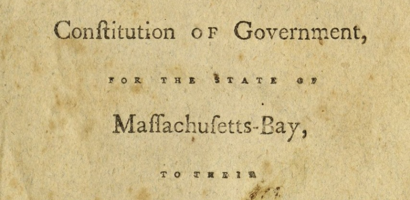
Another custom familiar to anyone who has looked at documents (whether printed or handwritten) from the 1600s to early 1800s is the long s. It looks a bit like a lowercase f, but without the crossbar. We see it only in the middle of a word, or as the second s of a double-s, making a word like “Massachusetts” a real labyrinth for our brains. The long s fell out of favor in the early nineteenth century.
Detail from the cover page of “An address of the convention for the framing of a new constitution of government, for the state of Massachusetts-Bay, to their constituents” (1780), demonstrating both a ligature in “Constitution” and many examples of the long s. Courtesy of Westborough (MA) Public Library via the Internet Archive.
In my next post we’ll turn the (nineteenth) century and explore what happened to handwriting during the Industrial Revolution and beyond.